How to Design Emails That Convert
Great copy gets people to read.
Great design gets them to act.
In email marketing, design is more than aesthetics—it’s about guiding the reader’s eye, clarifying your message, and increasing conversions.
Whether your goal is clicks, sign-ups, or sales, the structure and layout of your email plays a crucial role in making that happen.
In this article, you’ll learn how to design emails that not only look good but drive action.
1. Start With a Clear Goal
Before you open any design tool or template, ask:
What is the one thing I want the reader to do?
Is this email meant to inform, inspire, or convert?
Design should serve that goal. Every element—headline, image, button—should work toward the desired action.
2. Use a Simple, Clean Layout
A cluttered email confuses readers and dilutes your message.
Tips for simplicity:
Stick to one column for easy reading on all devices
Use ample white space to create breathing room
Prioritize clarity over creativity
Less is more—especially in email.
3. Optimize for Mobile First
Over 50% of emails are opened on smartphones.
Design with small screens in mind:
Use large, tappable buttons (at least 44px)
Keep text large and readable (14–16px)
Use short paragraphs and bullet points
Avoid side-by-side columns (they stack awkwardly)
Test on multiple devices before sending.
4. Create a Strong Visual Hierarchy
Guide the reader’s eye through:
Headline → Image → Text → CTA
Use bold fonts, contrast, and size to emphasize key info
Place the most important content above the fold
Think of it like a webpage—draw the reader downward toward the action.
5. Use Compelling Imagery—Sparingly
Images can enhance your message, but they shouldn’t be the message.
Tips:
Use high-quality, compressed images
Include alt text for accessibility and loading issues
Don’t rely on images for key CTAs—some inboxes block them by default
Custom visuals or product photos perform better than generic stock images.
6. Make Your CTA Buttons Pop
Your Call-to-Action (CTA) is where conversion happens.
Design tips:
Use a contrasting color that stands out
Keep text short and action-oriented (“Get the Guide,” “Try It Free”)
Make it big enough to tap on mobile
Repeat the CTA if the email is long
Position the primary CTA high and (optionally) again at the end.
7. Use Consistent Branding
Your emails should feel like a natural extension of your brand.
Include:
Logo placement (usually top-left or top-center)
Brand colors and fonts
Consistent tone and voice
This builds familiarity and trust over time.
8. Don’t Overload With Links
Too many clickable elements can confuse the reader and reduce conversions.
Stick to one main CTA, and at most 2–3 secondary links (like a blog post or social follow).
Every link should have a reason to be there.
9. Use Scannable Content Blocks
Structure your content for easy scanning:
Short paragraphs
Subheadings
Bulleted lists
Icons to break up text
People don’t read every word—they scan. Help them absorb your message at a glance.
10. Add Personalization in Smart Ways
Design can support personalized experiences:
Dynamic blocks based on subscriber data
Personalized images or banners
Product recommendations based on behavior
Keep it subtle and relevant. Personalization should feel helpful, not creepy.
11. Ensure Fast Load Times
Large files or bloated HTML slow things down—especially on mobile.
Optimize:
Images (compress without quality loss)
Minimal CSS and inline styles
Avoid embedded videos (link to landing page instead)
Fast-loading emails = more opens, more clicks.
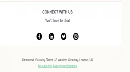
12. Include a Clear Footer
A good footer reinforces legitimacy and gives control to the reader.
Include:
Contact info
Social media icons
Unsubscribe link
Preference center (if applicable)
A clean, respectful footer increases trust and reduces spam reports.
13. A/B Test Design Variations
Design isn’t one-size-fits-all.
Test variations like:
Button color or size
Image vs. no image
Different layout styles
Placement of CTA
Track what gets more engagement—and keep improving over time.
Final Thoughts: Function Before Flash
Effective email design isn’t about fancy layouts—it’s about clarity, guidance, and persuasion.
When your design supports your message and makes it easy for readers to act, your emails start working for you—24/7.
Keep it clean. Keep it mobile-friendly. Keep it focused on one clear goal.
And you’ll start seeing more clicks, more conversions, and more loyal subscribers.