What Makes a Great Email Campaign?
What Makes a Great Email Campaign?
With over 300 billion emails sent daily in 2025, it’s no longer enough to “just send something.” Your audience’s inbox is crowded. Their attention span is short. So, what separates the emails that get opened, clicked, and loved from those that are trashed or ignored?
In this article, we’ll break down what makes an email campaign truly great—from strategy to execution—and how you can replicate that success in your business.
1. It Starts With a Clear Goal
Before you write a subject line or choose a design, you need to answer:
“What do I want this email to achieve?”
Common goals include:
Driving traffic to a landing page
Making a sale or promoting an offer
Delivering value (newsletter, tips, guides)
Encouraging engagement (survey, reply, social share)
Onboarding or educating users
💡Pro Tip: A campaign with multiple goals = a confused subscriber. Focus each email on one clear action.
2. Understanding Your Audience
A great email speaks to someone, not just at them.
Ask:
Who am I emailing?
What do they care about?
What problem am I helping them solve?
What tone and style do they prefer?
Use list segmentation to send relevant emails to the right people. For example:
New subscribers get a welcome series
Buyers get upsell or feedback emails
Inactive users get re-engagement campaigns
Relevance increases open rates, engagement, and conversions.
3. A Subject Line That Sparks Curiosity
The subject line is your email’s first impression. A bad one guarantees a quick delete.
What makes a great subject line?
Short and punchy (under 50 characters)
Clear, not clever—unless clever works for your brand
Personal when possible
Creates curiosity or urgency
Examples:
“You left this behind…” (cart abandonment)
“How to triple your email opens” (value-based)
“Only 4 hours left…” (urgency)
Also consider:
Emojis (if appropriate)
A/B testing multiple variations
Avoiding spam triggers like “FREE!!!” or “CLICK NOW”
4. Killer Preheader Text
Right next to your subject line is the preheader—the short preview that shows up in inboxes.
This is prime real estate, yet often overlooked.
Example:
Subject: “Last Chance to Register”
Preheader: “Your seat disappears at midnight. Don’t miss out.”
Write your preheader to support or extend the subject line, not repeat it.
5. Email Body: Clarity, Value, and Flow
Your email content should be:
Skimmable (use short paragraphs, bullet points)
Focused on one message
Clear in structure (headline > body > CTA)
Value-packed: either inform, entertain, or solve
Strong campaigns:
Hook attention in the first sentence
Lead readers down the page with flow
Include 1–2 CTA buttons/links (not 5+)
Align with brand tone and voice
Don’t forget to personalize using names, past behavior, or dynamic content.
6. Design That Enhances, Not Distracts
Great design supports your content—not overshadows it.
Key elements of strong email design:
Mobile responsive layout
Clear hierarchy (headline, subhead, body)
Ample white space
Consistent fonts and brand colors
Button-based CTAs (not just text links)
Use images sparingly and compress them for fast load time. Consider plain-text alternatives if your audience prefers minimalism.
💡Dark mode compatibility is essential in 2025—test how your design looks across platforms.
7. Personalization and Dynamic Content
Generic emails feel… generic. Great campaigns use personalization beyond the name.
Examples:
“Here’s your next step, Sarah” (based on past behavior)
“Since you purchased [Product A]...” (triggered by purchase)
“Based on your interest in [Topic]...” (from quiz or signup)
Dynamic content allows different users to see different blocks of content in the same campaign—tailored offers, recommendations, even images.
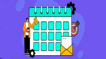
8. Timing and Frequency
Timing is everything.
Best send days: Tuesday, Wednesday, Thursday (varies by niche)
Best times: Late morning or early afternoon in recipient’s time zone
But great marketers go beyond guesses—they test and optimize.
Email frequency matters too. Too many emails = unsubscribes. Too few = forgotten brand.
Set expectations early:
“You’ll get 1 email per week with our top tips.”
“We’ll only email when there’s a sale.”
And stick to it.
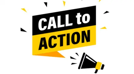
9. Strong CTA (Call to Action)
Every great email has one clear action you want the reader to take.
Examples:
“Download your guide”
“Reserve your seat”
“Shop the sale”
“Reply to this email”
Tips for high-converting CTAs:
Use action verbs
Make buttons large and noticeable
Repeat CTA once near the top, once near the bottom
Keep it emotionally relevant (“Get My Discount” vs. “Submit”)
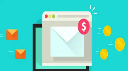
10. Metrics and Continuous Improvement
Great email campaigns are data-driven.
Track key metrics:
Open Rate
Click-Through Rate
Conversion Rate
Bounce Rate
Unsubscribes
Use the insights to:
Test new subject lines (A/B)
Adjust content length or structure
Improve segmentation
Resend to non-openers (with caution)
A winning campaign is rarely born perfect—it’s optimized over time.
11. Real-World Examples of Great Campaigns
🛒 E-Commerce
Subject: “Still thinking it over?”
Body: Short reminder with product image
CTA: “Yes, I still want it” (abandoned cart)
Result: 25% recovered carts in 24 hours.
🧠 SaaS Product
Subject: “Here’s what [Competitor] won’t tell you…”
Body: Case study comparison
CTA: “Try it free for 7 days”
Result: 18% boost in free trial signups.
📚 Online Course
Subject: “How [Student Name] went from 0 to $10k/month”
Body: Storytelling + offer
CTA: “Get Your Free Coaching Session”
Result: 3x higher replies and conversions.
12. Common Mistakes to Avoid
Sending without testing (broken links, typos, mobile issues)
Multiple CTAs that confuse the reader
Too much text or clutter
No segmentation—everyone gets the same message
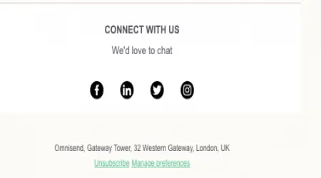
No clear unsubscribe or bad footer
Skipping analytics and guesswork-only strategies
Avoiding these alone puts you ahead of most.
13. Final Thoughts: Simplicity + Relevance = Success
Great email campaigns aren’t about flashy graphics or complicated funnels. They’re about clear, human communication.
If your email:
Reaches the right person
Offers something valuable
Says it simply
And guides them clearly…
…it will succeed.
In the crowded inbox of 2025, simplicity wins. Relevance wins. Respect wins.
Master these principles, and your next email campaign could be your most profitable yet.