
How to Craft the Perfect Call to Action in Email Marketing
You’ve written a compelling subject line, engaged your reader with a powerful hook, and delivered solid value throughout your email—but none of it matters if your call to action (CTA) falls flat.
In email marketing, your CTA is the bridge between interest and action. It's what turns readers into clickers, and clickers into customers.
This guide will show you how to craft CTAs that actually get clicked—by blending psychology, clarity, design, and smart placement.
1. What Is a CTA in Email Marketing?
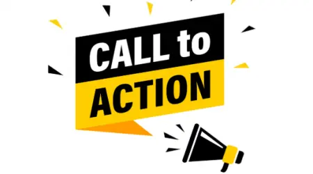
A call to action is a prompt that tells the reader exactly what to do next. It’s usually a:
Button ("Buy Now")
Link ("Learn more")
Text prompt ("Reply to this email")
But great CTAs are more than just commands—they’re invitations that motivate action.
2. Why Your CTA Matters So Much
Your CTA is the conversion moment. Without it, readers don’t know what to do next—and even the most engaging email goes nowhere.
Great CTAs:
Increase click-through and conversion rates
Guide users along their journey
Eliminate confusion and hesitation
Reinforce your email’s purpose
Every email should have one clear CTA goal. If you're sending emails without a strong CTA, you're leaving money—and momentum—on the table.
3. Components of a High-Performing CTA
Here’s what makes a CTA effective:
a. Clarity
Tell them exactly what happens when they click:
✅ “Download your free template”
❌ “Click here”
Be specific, not vague.
b. Action Language
Start with a verb:
“Start your free trial”
“Grab the checklist”
“See how it works”
“Join the waitlist”
Action = motion. Passive = hesitation.
c. Benefit-Oriented
Show what they gain:
“Get my free guide”
“Save 25% today”
“Unlock exclusive access”
The best CTAs answer the question: “What’s in it for me?”
4. CTA Placement: Where Should It Go?
Above the fold: Your CTA should appear early—especially in shorter emails.
After value delivery: In longer emails, build trust first, then pitch.
Repeated: It’s okay to repeat your CTA 2–3 times in longer emails—just vary the format (button, link, text).
Test placement based on the complexity and purpose of the email.
5. Types of Email CTAs (with Examples)
a. Text Link CTA
“Need help getting started? [Download the beginner’s guide here].”
Great for:
Educational emails
Soft-sell sequences
Minimalist emails
b. Button CTA
[Start Your Free Trial]
Highly visible and click-friendly—perfect for high-conversion goals.
c. Image or Banner CTA
Great for promotional emails, but should include ALT text and clickable backup links.
d. P.S. CTA
“P.S. Don’t forget—your 30% off code expires at midnight.”
Highly effective for readers who scroll quickly.
6. Design Tips for CTA Buttons
Your button design can make or break conversions.
Best practices:
Use a contrasting color from the rest of the email
Make it large enough to tap on mobile
Add padding and rounded corners for a modern look
Use simple, readable text (12–18px)
Leave white space around the button for focus
CTA buttons should stand out—but still match your brand.
7. CTA Psychology: What Makes People Click
Human behavior plays a huge role in CTA effectiveness.
a. FOMO (Fear of Missing Out)
“Offer expires in 12 hours”
“Only 7 spots left”
Urgency + scarcity drive immediate clicks.
b. Curiosity
“See what you’re missing”
“Find out what happened next…”
Open loops trigger click-throughs.
c. Personalization
“Start building your site, Sarah”
“Claim your guide based on your quiz results”
Tailored CTAs boost engagement.
d. Commitment & Consistency
Start with micro-commitments:
“Take the 2-minute quiz”
“Preview the course”
Small clicks lead to big conversions.
8. Common CTA Mistakes to Avoid
Too many CTAs: One email, one main action
Vague language: “Click here” doesn’t tell or sell
Unclear destination: Don’t surprise people with where they land
Cluttered layout: CTA buttons buried in walls of text don’t get noticed
Mobile unfriendliness: Make buttons thumb-friendly
Always test CTAs to find what resonates with your audience.
9. CTA Copy Testing Ideas
Try A/B testing the following:
“Download” vs. “Get”
“Start free trial” vs. “Try it free for 7 days”
Button vs. text link
First-person ("Get my template") vs. second-person ("Get your template")
Sometimes a single word shift can improve CTRs by 30% or more.
10. Micro-CTAs vs. Primary CTAs
Micro-CTAs = low-commitment actions:
“Read the full post”
“See how it works”
“Reply with your thoughts”
Use micro-CTAs to nurture or guide. Use primary CTAs for core conversions like sales, signups, or bookings.
Every email should have one clear primary CTA—but can include micro-CTAs if relevant.
11. CTA Strategy Across Email Types
Welcome Emails: “Set up your preferences” or “Watch the intro video”
Newsletters: “Explore the full article” or “Share this with a friend”
Promos: “Grab 20% off now”
Re-engagement: “Still want to hear from us?”
Post-Purchase: “Leave a review” or “Refer a friend”
Align the CTA with the intent and context of the email.
Final Thoughts: Every Email Needs a Next Step
A perfect email without a clear CTA is like a great movie without an ending—it leaves people unsure what to do next.
Whether you're asking someone to read a blog post, sign up for a course, or reply with a thought, your CTA is your compass. It directs the relationship forward.
Keep it clear. Make it compelling. Design it for action.
When you master the CTA, your emails won’t just get read—they’ll drive real results.
